Hello my lovely readers! Here is my question for you today. Do you know why a lot of blogs fail?
Most people actually don't (including me sometimes). Here are the things that I have picked up that will hurt your blog, though.
A Messy Design
When someone first goes on a website the first thing they judge is not the content or the information but the design. What I mean by a messy design is a:
-Cluttered sidebar
-Bad Background
-No Header
-Etc
If you don't like design or coding and don't want to pay there are a lot of options. There are a lot of websites that have nice designs you can download. There are also some designers that will do it for free. I highly recommend Allie who did my design. She's awesome!

Bad Spelling
I am actually really really bad at spelling. When I look at some of my older posts I cringe. But thing is I have gotten better (I have gotten better, right?). So even if you aren't that great at spelling it is no excuse. A couple mistakes is fine. But if you have 20 mistakes like every single post then it looks very unprofessional.


Hard to Read Text
If your text is too small or in a weird color it will turn people off. A couple of months ago I started following this blog because of the amazing posts but then the text changed to a color and size I couldn't read at all. I kept following it for a little bit hoping the text would change back but it never did and I ended up following the blog. That is how bad hard to read text is. Here are some of my tips when choosing a text.
-Don't make it in cursive (because some people can't read cursive including me)
-Make the color black
Remember if you have to squint or have glasses on to read it it is way to hard.
Remember if you have to squint or have glasses on to read it it is way to hard.
Missing Search Bar
I have noticed that there is kind of like an unspoken rule that you should really have a search bar on your site. If people find a blog they like then they might want to explore it more. Having a popular posts gadget is also key but a search bar is just as important. Plus there are a lot of ways you can make a search bar look cool and unique but requires a bit of coding.
No images
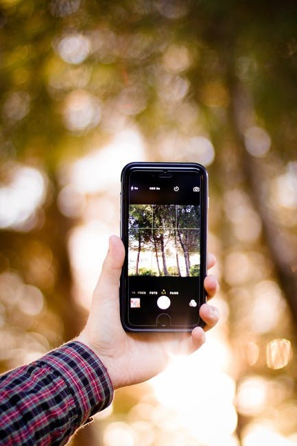
Images are very very pleasing to the eye. It gives the readers a break from blocks of text. It makes the blog look good. Pretty much it is key to a good blog. And you don't even have to take the photos yourself. There are lots of free stock photo sites out there. I highly recommend pexels or pixabay. I use both of the sites a lot.

No Share Buttons
When readers like a blog they want to connect with you and share it. But however good your blog is your readers will still probably be pretty lazy. Make it easy for them to share by putting buttons in a noticeable place. People sharing your posts is a really awesome way to grow your blog. I have my buttons at the side of the page. If you like some of my posts I would love for you to share them. It would means a lot to me.
Too Many Ads
You don't want your blog to look loaded with ads. Your blog is supposed to look like it is for your readers (even if it is for you). Ads most of the time look really bad and messy. I'm not saying you shouldn't have ads though. That is fine. But be very sparse with them.
Super Long Loading Time
If your blog has a loading time of more than 20 seconds it is very bad. Readers are lazy and they do not want to wait. There are probably other blog posts on the subject and so if your post takes super long to load they will just x it out without even looking at the page. Some reasons why your loading time might be long:
-There are too many things on your sidebar
-Super big images
-Too much stuff all together
-Too much stuff all together
Do you have/make any of these things on your blog? What others things will hurt a blog? Do you agree with me? Should I do more blogging posts? Do you take your own images or get them from somewhere? If you do get them from somewhere then where?


Great post, Nabila! I loved all your points, they were all very good. :)
ReplyDeleteAs for finding images, I find my own at Pixabay.com. They have a great selection and all I have to do it type in some keywords. It's a great site for featured post images and background images. ;)
~ Suzy | Craftz'n'Craziness, Lookin' Good Designs
Thanks Suzy! I'm happy you thought they were good :) I use pixabay a lot too.
DeleteAll of these points are so true! I'm planning on updating my design when I get the chance ♥
ReplyDeleteAmy xx
Little Moon Dragon
Thanks Amy! I can't wait to see your new design!
DeleteGreat points!!
ReplyDeleteThanks Kiley!
DeleteThese are fantastic tips!! You'd be so correct with these since you're a very experienced blogger.
ReplyDeleteAnd I agree, pictures/photos on blogs are the best! I mean, there's nothing better than eye candy! And gifs are cool too.
These tip posts are great!
-Elsa :)
Thanks Elsa! Awww! You saying I'm experienced makes me very happy. Although I'm not that great yet. Definetitaly. You have to have photos. Haha. Totally! Gifs are also cool. I'm happy you like my tip posts Elsa. Your comments always make me smile. :)
DeleteThese are great tips! Allie is a great blog designer. :)
ReplyDeleteThanks Emily! Allie is pretty awesome :)
DeleteThis is such a good post Nabila! I agree that mending these things definitely improves how I see blogs that I read x
ReplyDeletewww.britishmermaid.com
Thanks a lot Cara!
DeleteCan I have a link to who designed your blog? Thanks :)
ReplyDeleteI would love to give you a link too who designed my blog Livy! You can find her website at http://alliesblogdesigns.blogspot.com/. Didn't she do an awesome job on my design?
DeleteYeah! It looks awesome!!! I just got a new blog and I want it to look perty! Sorry, that was really weird. Ok, thanks for telling me :D
DeleteYay and thanks! I totally get wanting to make your blog look good. It is totally fine Livy. Totally!
Delete